
By Charlie Ovink & Vanesa Jorda
There is no doubt, it has been an historic election. From the stunned UN crowds at the climate conference in Marrakech to the pages of Sina Weibo, around the world the reaction has been one of shock and disbelief. With near unanimity in the polls as recently as the day before the vote, the gap between the predicted Clinton win and the final Trump victory is looming large over the entire statistical modelling field. Combine it with the predictions of a rejection to Brexit and an acceptance of the Colombian referendum, and 2016 is looking like a very bad year for the fortune tellers. How did the polls, deployed by very smart people, and analysed in some very smart places, get it all so wrong? The short answer is that they didn’t. There are two main problems understanding what the polls tell us, one is simple, one unfortunately, is less so.
First, we all know in our hearts that polls are not predictive. No poll, no matter how accurate, can tell us the outcome of a future election. Polls tell us the likely outcome of an election that took place on the day the poll was conducted. The closer we get to a real election the more “accurate” the polls, and hence the estimates based on them, should become. This has value, especially to the politicians who want to calibrate their efforts. Polling has suffered with declining response rates, and other issues, but at the very least it gives us a snapshot of what those polled think.
Second, polls are read, and communicated, in a remarkably unhelpful way. The polling data below, from RealClearPolitics, shows a useful example. A cursory examination shows a slight, but general edge for Clinton. A more careful reading suggests that no sharp conclusions can be drawn at all.
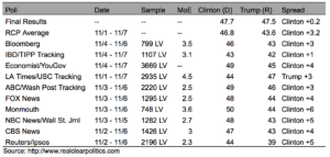
The percentages in favour of Clinton or Trump are calculated from the samples of likely voters (LV) which, even when relatively small, are representative of the whole population. Different samples yield different estimates of the proportion of voters for each candidate. To extrapolate these results to the whole population, these estimates should be presented with margins of error (MoE), which are associated with a particular level of “confidence”, usually 95%.
This part is rarely reported when we hear about polling: MoE are used to construct confidence intervals, which are the crucial tool for this form of parsing. Confidence intervals are given by the proportion of votes of the candidate according to the sample plus/less the MoE, indicating that we are 95% confident that this range of values includes the proportion of votes of the candidate the day of the election. This is very, very different from saying that there is a 95% certainty of, taking the Bloomberg poll as an example, Donald Trump receiving 43% of the vote, and this is where the difference between a scientific understanding of the data, and the understanding we generally consume in the media, is most obvious.
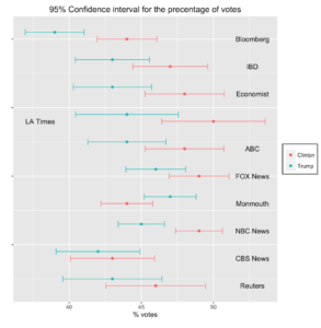
 Source: Authors’ calculations
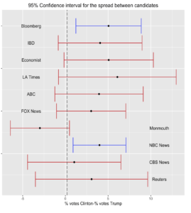
In the illustrations, the 95% confidence intervals for each candidate, per poll, are provided. Only if the two groups do not overlap (i.e. the range for Clinton and the range for Trump) can it be concluded that the pools of supporters of both candidates are statistically different in size. This conclusion might be a bit shocking at first glance, especially because the gap between both candidates (the column labelled “spread” in the table) was substantial in most cases, pointing out a clear lead for Clinton.
However, the “spread” is just what a statistician calls the “punctual estimate”, which might be reported along with a margin of error or a confidence interval. Broken down in the right panel, the confidence intervals for the “spread” paint a stark picture. The data does not establish any particular likelihood that the “true” percentage is in the middle of the range, simply that there is a 95% confidence it is somewhere along it. Crucially, this means that when that range includes zero (i.e. no gap between the votes for each candidate), the sample cannot be said to favour either candidate. For the data in the table, most of these intervals do include the number zero, a tied sample, and hence in 8 out of 10 cases, it is not clear that the proportion of votes for each candidate was statistically different. In short, almost all the polls in the group turn from seeming to show a trend for Clinton, to showing nothing of the sort.
What the polls actually presented were degrees of support for each candidate that were not “significantly different”. That is – the polls were not “predicting” a Clinton victory, nor a Trump victory, mostly they said the degrees of support couldn’t be meaningfully distinguished. In a weather forecast, that’s one thing, there isn’t necessarily a strong tipping point. When the grey area is clouding the 50% mark needed for a victory, and the subject is the American presidential election, it’s a very important distinction.
Political campaigns are getting longer, media outlets that are ever more niche and polarising are arising, and the bandwidth of information that reaches us is ballooning. The more data like this becomes part of the public, political narrative, the more dangerous it becomes for it to be misunderstood. The desire for a kind of “forecast” is strong, and understandable, but the shock that comes when a consensus prediction fails demonstrates the serious risks involved. Allowing unclear, and poorly explained, information to form a narrative can cause a lack of preparation for outcomes that should not have seemed so far-fetched. So in this case, what did the polls say? If you knew how to read them, they said it was a lot closer than either side wanted it to be.